


Why use RadixUI?
RadixUI is an open-source component library used to build friendly and accessible design systems and web applications. These components are unstyled and can be customized to user preferences.
RadixUI offers a wide range of UI components, including buttons, forms, modals, menus, tooltips, and more, focusing on simplicity, performance, and accessibility.
Getting started…
In this tutorial we are going to create a RadixUI modal dialog component which focus is automatically trapped, works in an uncontrolled way by default but can also be controlled . We are going to use TailwindCSS to style it.
You can use npm or yarn to install the package, here we use npm:
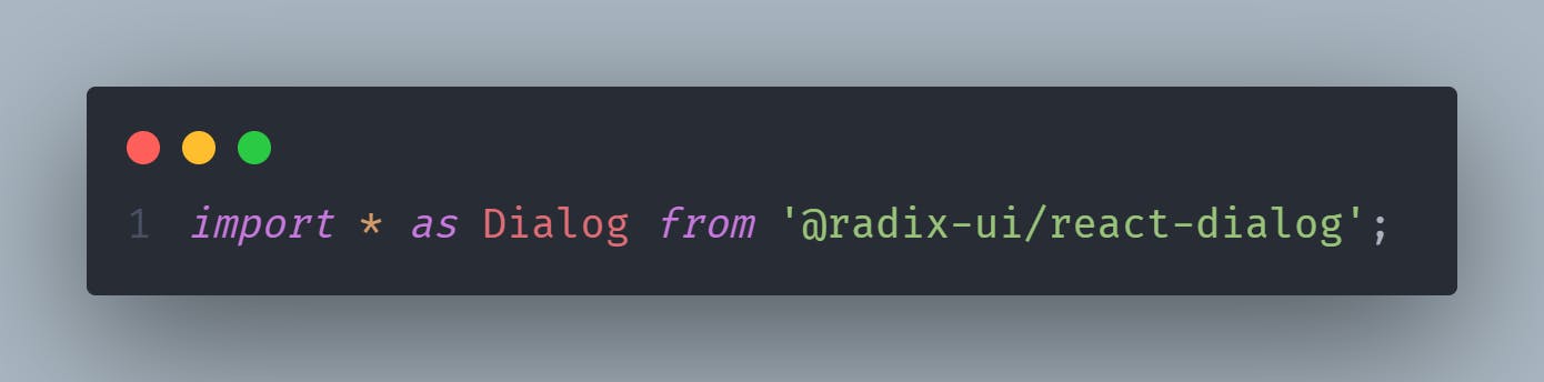
npm install @radix-ui/react-dialogImport the Dialog component:
Let’s assume that TailwindCSS is already installed in the project.
Create a dialog modal as the code below:
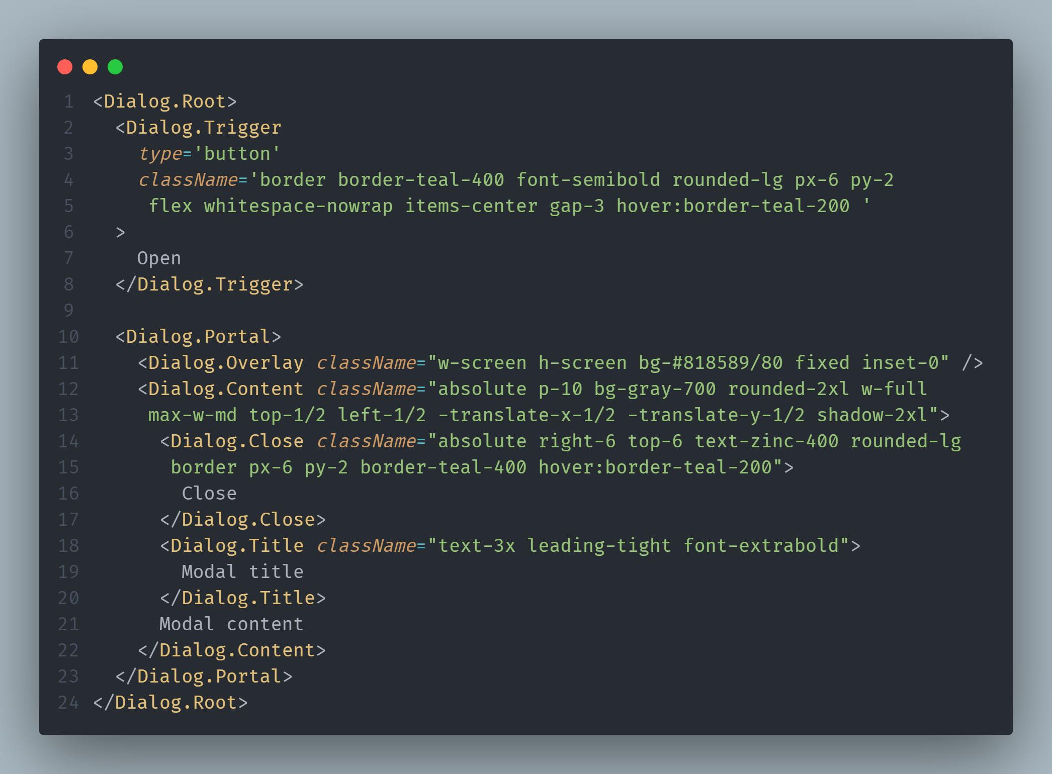
<Dialog.Root> contains all the parts of a dialog.
<Dialog.Trigger> component is used to trigger the opening of the modal.
<Dialog.Portal> component portals your overlay and content parts into the
body.<Dialog.Close> component is used to close the modal.
<Dialog.Overlay> component creates a overlay behind the modal.
<Dialog.Title> an accessible title to be announced when the dialog is opened.
<Dialog.Content> contains content to be rendered in the open dialog.
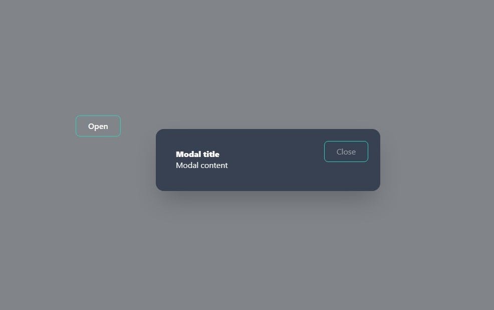
The Dialog component created will look like this:
RadixUI simplifies the development process while ensuring accessibility and performance.
Thank you for reading.
If you liked this article shared it!
I appreciate your feedback.