

In this post I will show you how you can make entire interfaces with a property of the CSS Grid.
CSS Grid Terminology.
First lets take a look quickly about CSS Grid terminology.
Grid Container : The element on which grid is applied. The grid container is the parent of grid items.
Grid Item : All directly nested elements of a grid container.
Grid Cell : Every column in every row is a grid cell.
CSS Grid can handle columns and rows, it is a 2-dimensional system.
The Grid container property.
grid-template-areas: With this property, we define the names of the grid areas and reference them with the grid-area property.
The Grid item property.
grid-area: With this property you give a name to an item so that it can be referenced in the grid-template-areas template.
Creating a template.
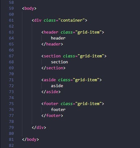
In the body of the HTML file, we have a div element with class container. This is the parent element. Inside of the container we created four children elements ( header, section, aside and footer) each with class grid-item.
With the CSS file we set layout with Grid. First, we define the div with class container as a grid container. After, using the property grid-template-areas we make the grid template by referencing the names of each grid-area property. Repeating the name of a grid-area causes the content to span those cells. A period ( . ) makes a empty grid cell. And none signifies no grid areas are defined.
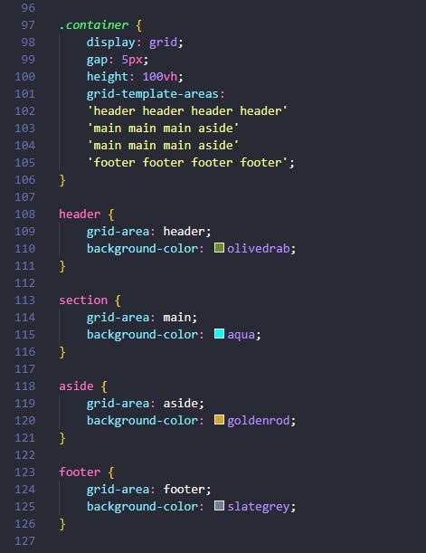
This is a template with four columns and four rows.
The header spans all four columns in the first row.
The footer spans all four columns in the last row.
The main spans the first three columns in the second and third rows.
And the aside spans the last column of lines two and three.
We also define a gap: 5px; and the height: 100vh;.
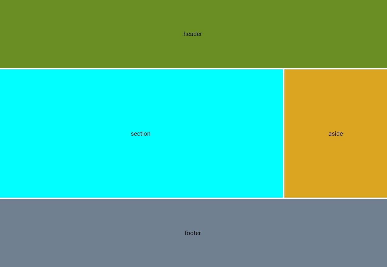
The result is shown in the figure below:
We can change the size of each grid-item with the properties of the grid container: grid-template-columns and grid-template-rows.
The CSS grid is a powerful tool to create entire layouts in a simple and effective way.